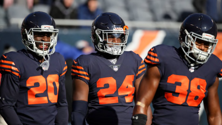
3. Orange and Blue stripes (1920’s)
The Bears pulled these out in1994 and lest just say they weren’t the greatest looks. Granted they are much better than the throwbacks the Packers and Steelers have come up with, but that doesn’t make it much better.
The only reason these rank higher than the all orange jerseys is they are at least paying homage to when the Bears played their first season and because the main color is the navy. They also went with the pants to complete the look.
The pale gold color, for lack of a better description, is again not a great look on the pants especially with trying to “match” the jersey. Yes, it is somewhat historically accurate but the color scheme is just horrible and I get that is what a lot of teams did back when the first got started but it doesn’t make for a great look.
I actually don’t mind the orange stripes on the jersey but anytime you are using vertical stripes it makes it look more like a ref than a football player. I guarantee players don’t want to be confused for refs.
Luckily for the fans, the Bears decided to only wear these a few times and our eyes were saved because of it.
They do get a few bonus points for using the classic orange and navy colors as some other teams (cough Packers) had completely different colors that just looked horrible.
Yes this is a nod to their starting days but they could have done so much better with this uniform and thankfully we probably won’t have to see it again.
