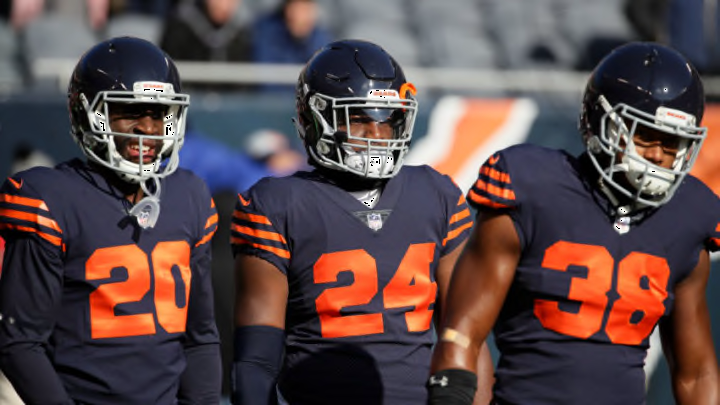
2. White jersey and orange socks (1936)
Ok, the picture above is not the new uniforms, but you can see a video here and here.
Personally, I love the look, from the helmet all the way down to the knees. If they would have just stopped there, this could be one of the best looking uniforms in the NFL. But then they had to add the socks. What were they thinking with the socks? I guess the better question should be what were they thinking in 1936?
Obviously, looks were a lot different in 1936 and they weren’t in their wildest dreams thinking they would be uniforms worn in the future of 2019.
The best part of this, though, is they are almost identical to the uniforms from 1936. They didn’t have a facemask back then, but besides that, they look almost the same. They were able to do the same helmet because the shell color stayed navy blue.
I like the stripes on the shoulders along with on the arms. It’s a good look and the alternating navy and orange color really pop from the jersey. It was smart to go with the white jersey as I don’t think the stripes would have looked good on a navy jersey.
The navy pants looked good also, as I think the white pants would have been too much with this look. It again is also accurate to the uniforms they wore before.
The socks are were the uniform goes down a notch. I get it is what they actually wore back then but the horizontal stripes the whole way up the socks make it look tacky. Orange socks is not necessarily a bad thing, but fewer stripes would have been much better.
The helmet is getting mentions of matching the University of Michigan and Princeton a lot, but it is definitely not a bad thing. I know a lot of people don’t want to stray from the C on the side of the helmet but for this look, it works.
If you can get over the bad socks, this uniform is solid. It could be a whole lot worse and when you talk about throwbacks sometimes worse is what you get. The uniform, jersey, and pants are all very good. If it weren’t for the socks this would be the best throwback the Bears have.
