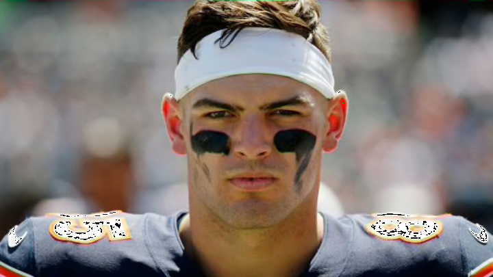
Chicago Bears’ worst-drawn logos No. 1: Darnell Mooney, 49ers’ logo
Starting with Darnell Mooney, it’s easy to say that his football career will seemingly go further than his art career. In all honesty, this looks more like the San Francisco Giants’ logo than the 49ers’ logo.
That’s alright, Moon Man. If you go for another 1,000+ yards, Chicago Bears fans will completely forget this one. But for now — yikes.
Chicago Bears’ worst-drawn logos No. 2: Jaquan Brisker, Packers’ logo
This one was tough because it’s a rather simple logo to do. As long as the G is elongated a bit, the logo is pretty much done.
Between that and the scribble-drawing of the green background, the decision was made for me.
Maybe it’s a Green Bay Packers rivalry thing, but all-in-all, Jaquan Brisker dropped the ball on this one. Thankfully, he won’t be dropping many footballs in his career with the Bears, football seems to be the better career path.
Chicago Bears’ worst-drawn logos No. 3: Cole Kmet, Cowboys’ logo
This one. This is likely the absolute worst logo drawn of the bunch. There’s another that competes with Cole Kmet’s for the worst, but it’s a close call.
Week 8
— Chicago Bears (@ChicagoBears) May 13, 2022
🎨 @ColeKmet pic.twitter.com/Po9oLccIgP
All he had to do was draw a star, so the criticism is justified on this one. Apparently, Notre Dame didn’t require star-drawing for admission.
That said, as long as Cole Kmet can become a focal point of the new Luke Getsy offense and continue his chemistry with Justin Fields, this very poorly drawn star will be forgotten.
